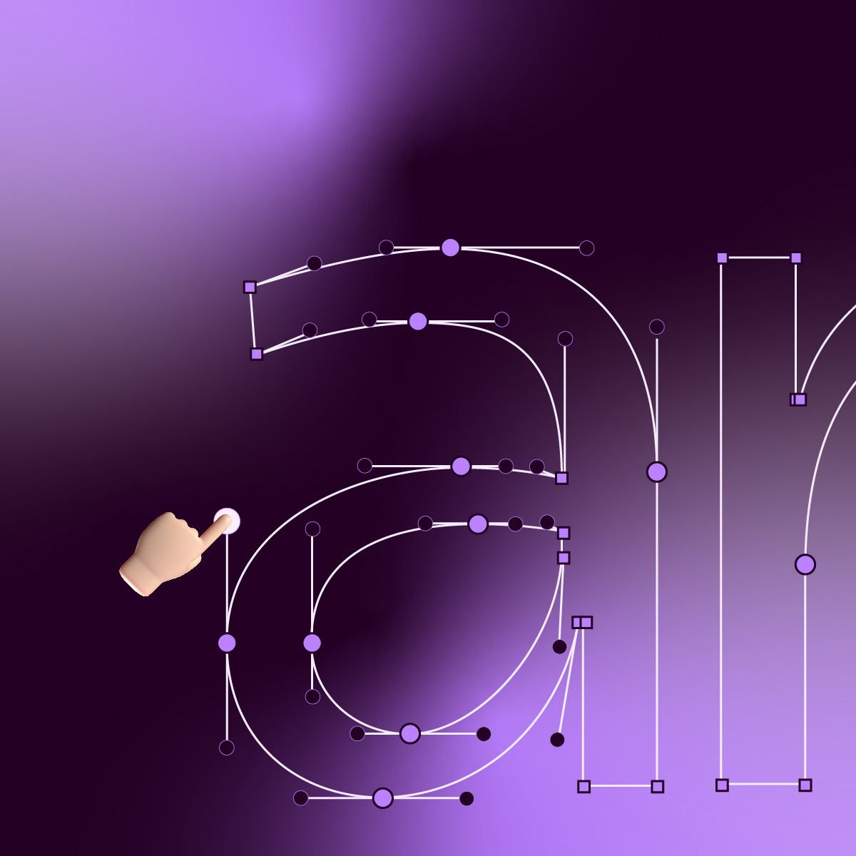
Akuto® Display
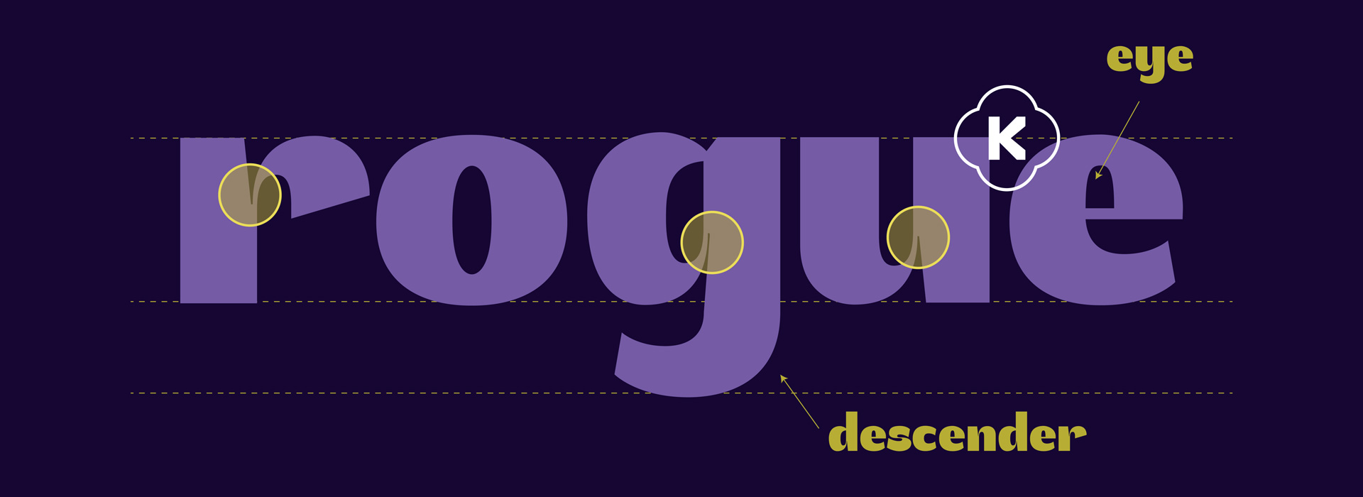
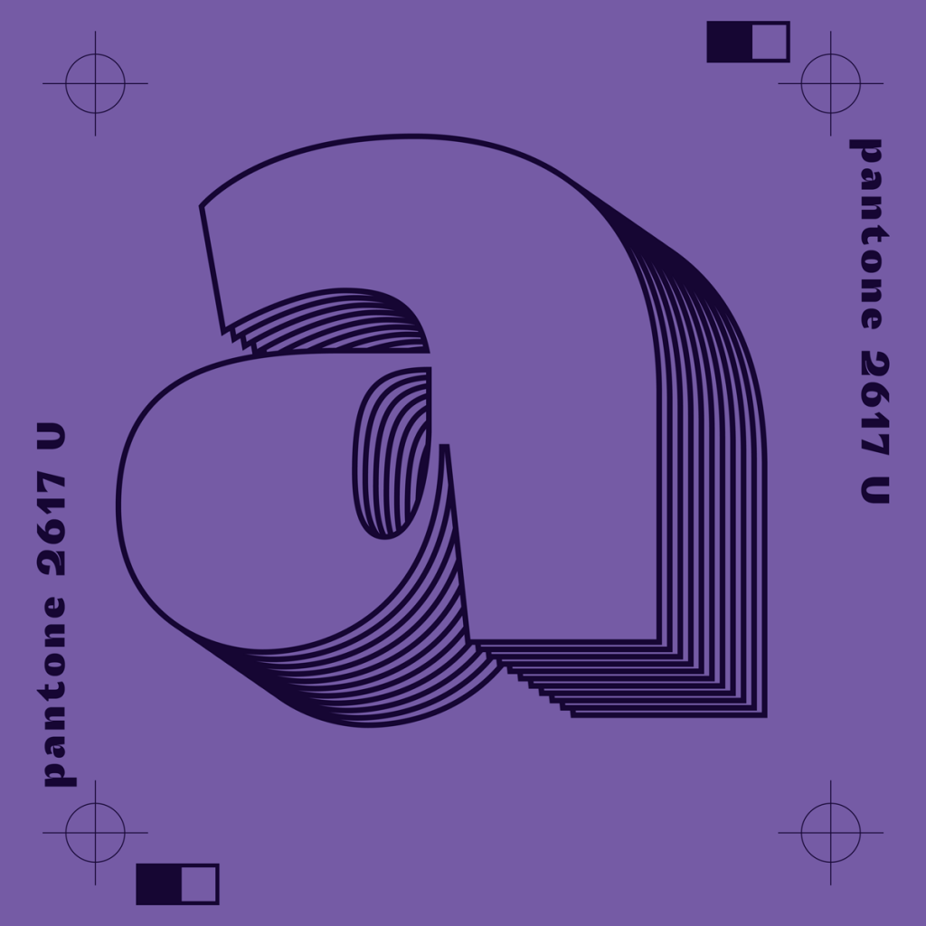
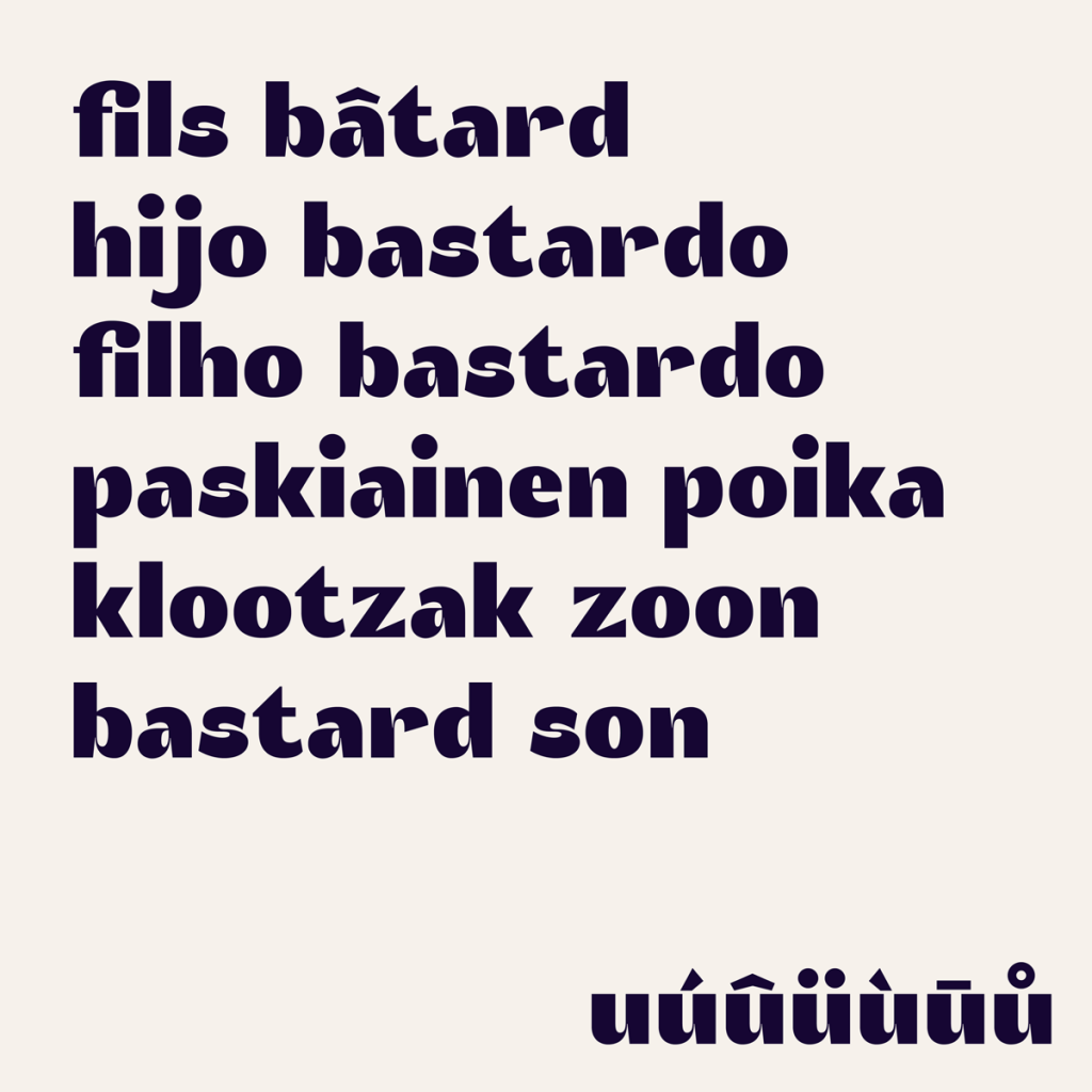
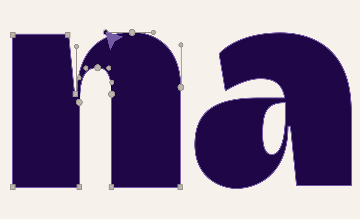
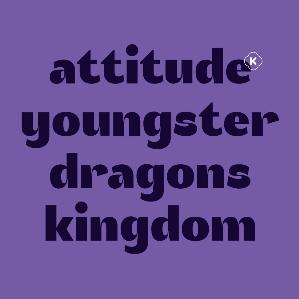
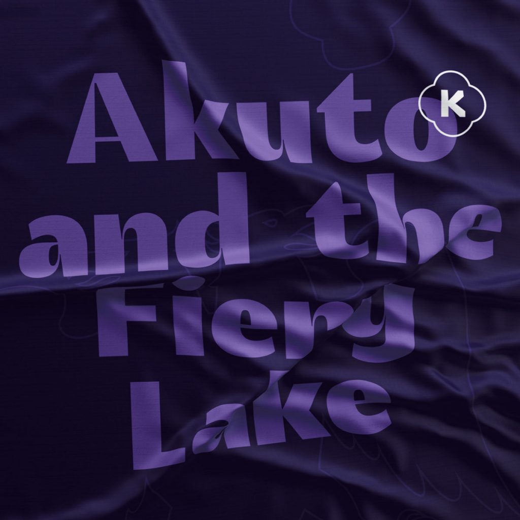
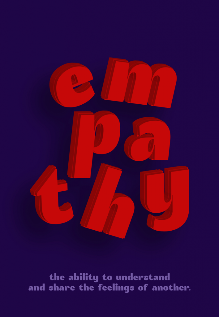
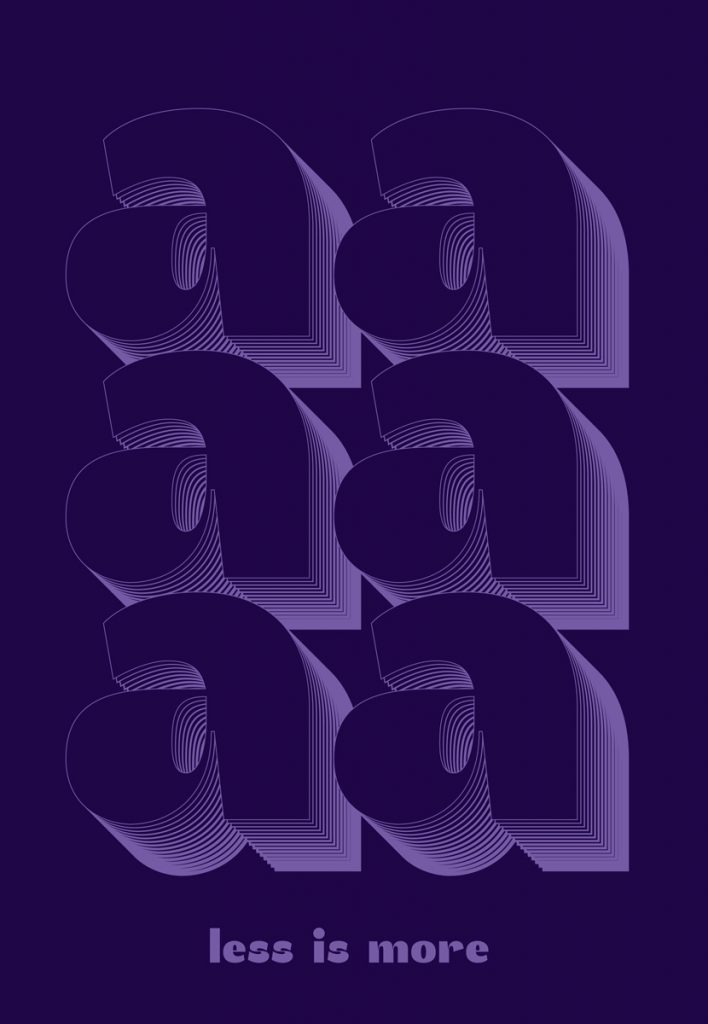
The Akuto typeface reveals a charismatic personality with a fair balance between its humanist side and its geometric side. It breathes through uppercase, lowercase, numbering, diacritics and punctuation characters. Conceived with a specific purpose, Akuto Display is a digital typeface that demands to be seen, instead of read. This font is best suited to be applied in newspapers, magazines, books or (not very extensive) titles.

Once upon a time, in a very distant kingdom, there was a king who lived in a palace.
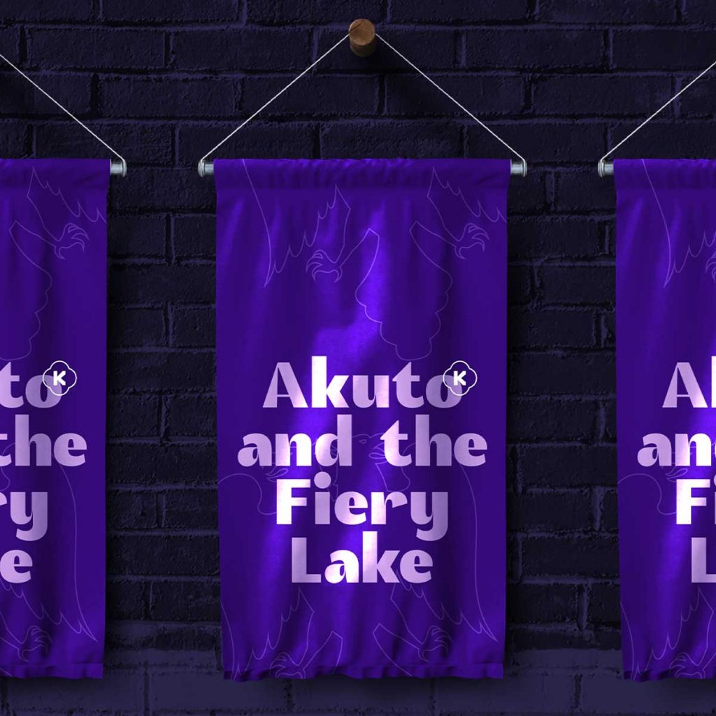
King Sans Serif had a simple soul but magnanimously ruled over his kingdom with a modern and minimalist attitude. He was known for his audacious and authentic personality and because he was accessible and easily mingled with the commons, he was very dear to everyone.


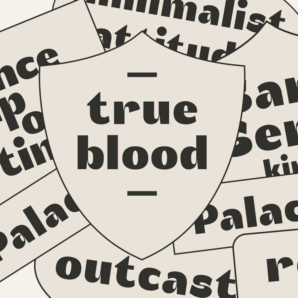


King Sans Serif had many sons and each of them had very specific and differentiating characteristics – some were grotesque, others neo-grotesque, some were geometric and some others were humanistic.
But King Sans Serif also had a big heart and, whenever he could, he got involved with other styles, giving birth to some bastard children. These unfortunate children were outcasted to menial classes.
One of these outcast children was self-determined Akuto, who embraced his nature as a digital display typeface and followed his own path.

Glyphs
Designer: Brígida Guerreiro
Release Date: 2019
Formats: OTF, TTF, WOFF, WOFF2, EOT
Character Set: Basic Latin, English Letters, Uppercase, Lowercase, Numerals, Punctuation, Symbols
Opentype Features: Kerning
Supported Languages: Western European
download specimen pdf


