Sakasu®
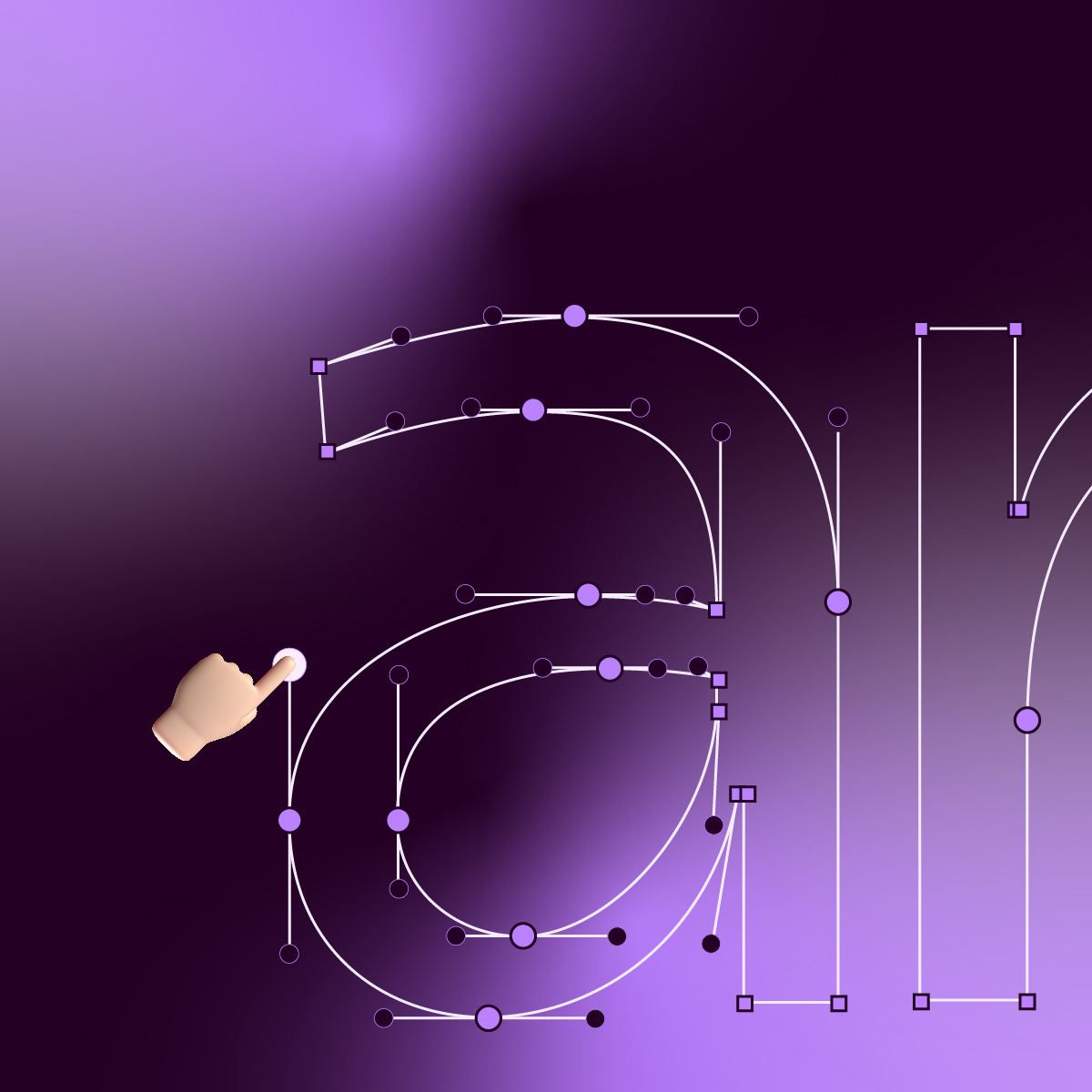
Sakasu is a digital typographic font meant to be seen. It is a perfect fit for short-length and mid-length titles as in newspapers, magazines or books. Sakasu includes a special set of characters that present ligatures to provide combinations of two letters in the same glyph. Both Sakasu Display and Sakasu Decorative, offer a vast number of relationships that allow you to assign more personality and charisma to a word or phrase.


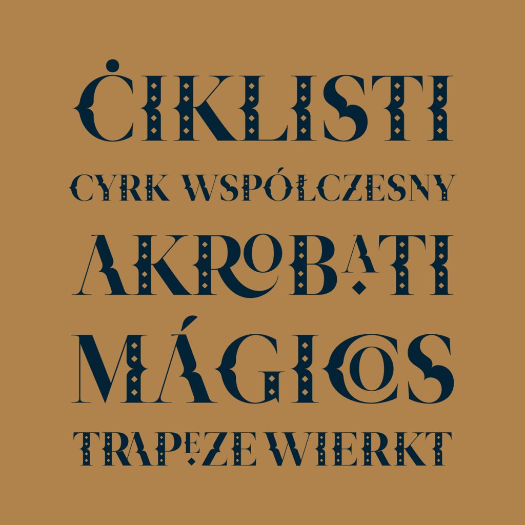
Ladies and gentlemen, boys and girls! Kobu Foundry has the honour and pleasure of presenting the most beautiful, the most irreverent and the most extraordinary of the display fonts born from the circus imagery… Sakasu!
Sakasu’s name derives from the Japanese, meaning “circus”.
This digital type font shows a delicate personality that sways with irreverence throughout its design.
Its timid serifs reveal a certain elegance and beauty. Its formal roots make the connection of the Roman style with the circus movements, channelled through its key decorative motif – the diamond.

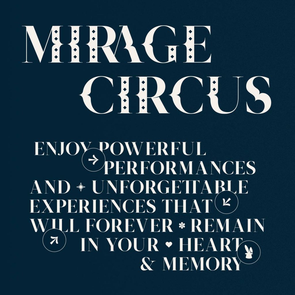
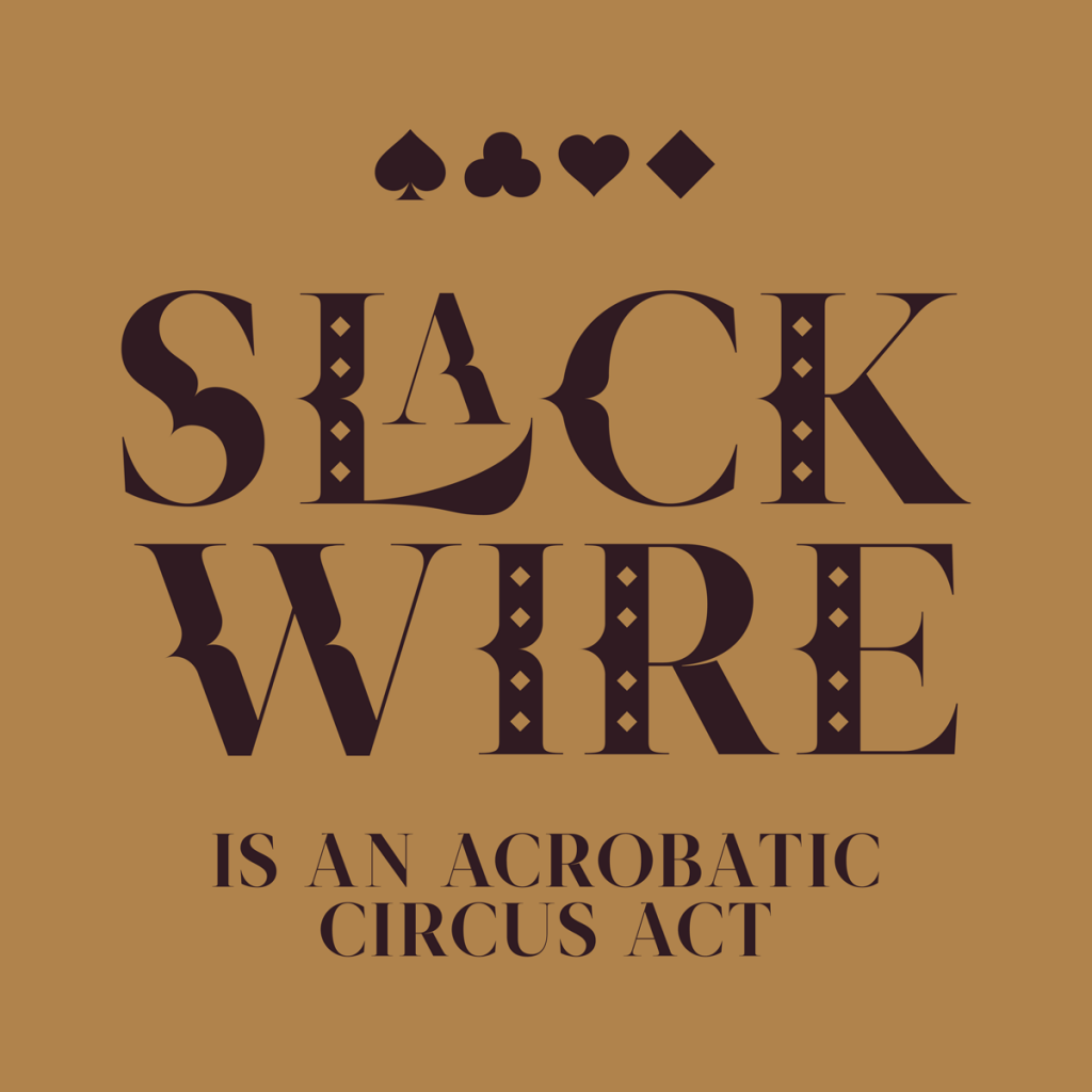
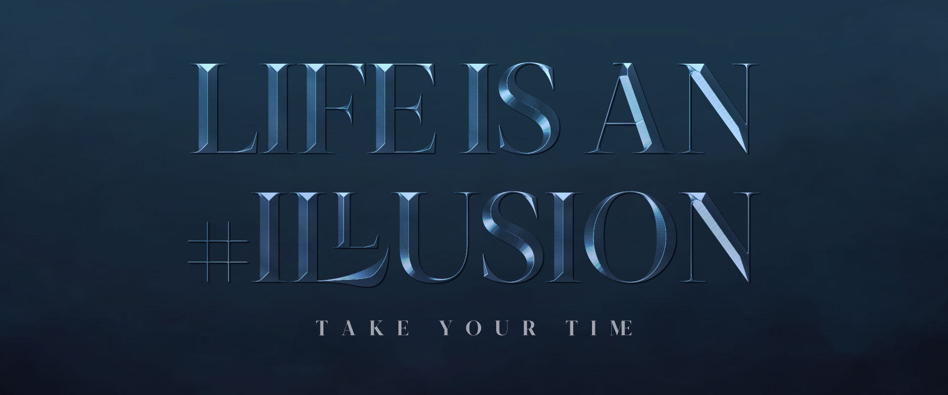

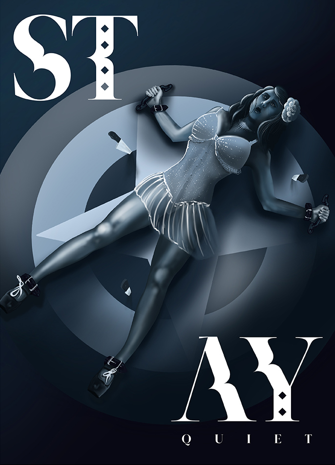


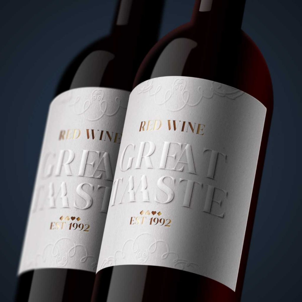
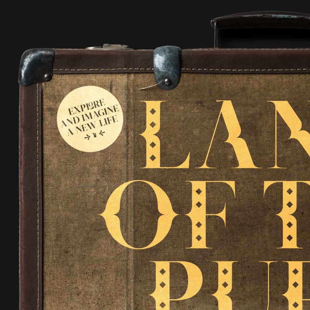
When a magician says “Abracadabra!” and a rabbit comes out of his top hat or when an acrobat flaunts his flexibility in the middle of the arena, those are moments of amazement and audacity. This “wow factor” comes up translated in Sakasu through its uppercase characters, Roman numerals, ligatures, diacritics, punctuation and symbols. These features give Sakasu a unique personality and add a special spark to its projects.

Feeling lucky? Find the pairs
Glyphs
Designer: Brígida Guerreiro
Release Date: 2019
Formats: OTF, TTF, WOFF, WOFF2, EOT
Character Set: Basic Latin, Uppercase, Numerals, Roman Numerals, Ligatures (OTF and TTF), Diacritics, Punctuation, Symbols
Opentype Features: Kerning, Ligature
Supported Languages: Western European, Central European, South Eastern European, Pinyin
download specimen pdfSakasu® is part of the Meji Adventures Font Collection.
Experience the whole story through the game map.
play the story


